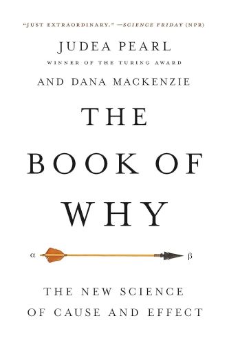
This summary of The Book of Why: The New Science of Cause and Effect by Judea Pearl and Dana McKenzie explains how statisticians misunderstood causality for a long time and how causal models can help us to better understand and control the world around us.
Estimated time: 20 mins
Buy The Book of Why at: Amazon (affiliate link)
Key Takeaways from The Book of Why
- Statisticians woefully misunderstood causation for a long time. In the 1980s, Pearl sought to better understand causality in the hopes of developing Artificial Intelligence that could match or exceed human-level intelligence.
- The Ladder of Causation is a metaphor to describe the different ways in which humans, animals and computers understand causation. There are 3 rungs:
- Seeing (observing correlations). Most animals and computers (as at 2017) were on this first rung.
- Doing (making interventions). Early humans and some animals are on this second rung.
- Imagining (counterfactual reasoning). Humans are on this third rung. Our ability to imagine what could have happened if one thing changed likely played a big role helping us understand and control our environment.
- Seeing has limits. Causation has a direction but correlations and probabilities do not. Data alone does not tell you anything about the underlying causal relationships.
- While seeing is passive, Doing is active. We understand how the world works by forming hypotheses, testing them with interventions, and then getting feedback on our actions. The ideal intervention is a randomised controlled trial (RCT), but this is not always feasible.
- Causal models can offer an alternative way to move from the first to the second or even third rungs on the Ladder of Causation. They help us:
- condition on the right things (confounders) and not the wrong things (mediators and colliders); and
- use data to reach causal conclusions based on certain assumptions.
- Limits of causal models.
- The usefulness of your model depends on how accurately your diagram matches reality.
- You can falsify models but you cannot prove a model is correct.
- Some hypotheses can only be tested with interventions.
Detailed Summary of The Book of Why
Statisticians misunderstood causation
For many years, statisticians woefully misunderstood causation. When the Statistical Society of London was founded in 1834, its charter said that data was to receive priority in all cases over opinions and interpretations. Data was “objective” while opinions were merely “subjective”. In the eyes of Karl Pearson (a leading statistician) and many of his followers, causation was nothing more than perfect correlation.
But causal analysis requires the user to make a subjective commitment or hypothesis—it is not, and cannot be, fully objective. Pearl describes in some detail how and why statisticians ignored causation for decades, even when outsiders like Sewall Wright came up with breakthroughs that showed how useful causal thinking could be.
How Pearl came to study causation
Pearl’s background is in computer science. He has spent decades working on Artificial Intelligence (AI) and invented Bayesian networks in the 1980s. These networks are based on Bayes’s Rule, a mathematical rule used for reasoning under uncertainty. Bayesian networks are used in many applications, including spam filters, speech recognition software, weather forecasting, evaluating potential oil wells and disaster victim identification.
But despite their strengths, Bayesian networks still fail to reach human-level intelligence because they only deal with probabilities. In the late-1980s, Pearl realised that machines’ inability to understand causal relationships may be the biggest barrier to achieving human-level intelligence. So he took a detour from his work to better understand causation.
The Ladder of Causation
When one thing causes another thing, changing the former can change the latter. No other species understands this as well as humans do.
Pearl uses the Ladder of Causation to describe different levels of understanding. There are three rungs:
- Seeing. Most animals and computers are on this rung, learning from association only. An owl can see how a rat moves and figure out, based on past observations, where it will be a moment later. But it doesn’t understand why the rat moves from one point to another.
- Doing. Creatures that can make plans and use tools (e.g. early humans and some animals) lie on this rung. They can experiment to learn how the world works.
- Imagining. Humans can think counterfactually and therefore lie on this highest rung. By the time children are three, they already understand the entire Ladder of Causation.
Around 50,000 years ago, humans underwent a Cognitive Revolution, which changed everything. In the book Sapiens, Yuval Harari posits that the ability to imagine non-existent things allowed humans to make plans based on a mental model of reality. This let us experiment with different scenarios by making alterations to our mental model, and learn from others’ experience—e.g. will adding more people to a hunt increase our chance of success? What if we changed our direction of attack?
Every other creature can see what is. Our gift, which may sometimes be a curse, is that we can see what might have been.
The reason Pearl says this ability may sometimes be a “curse” is because counterfactual thinking also allows us to assign blame and feel regret. Unlike other animals, we can compare what happened with what might have happened under some alternative hypothesis.
The limits of Seeing
Some associations are causal but others are not. The world is not made up of dry facts (data), but facts that are “glued together” by cause-and-effect relationships.
If I could sum up the message of this book in one pithy phrase, it would be that you are smarter than your data. Data do not understand causes and effects; humans do.
Causation has a direction
The two different causal chains below can produce exactly the same data and the same independence conditions:
- A → B → C
- C → B → A
When we hold B constant, A and C are independent under both chains. However, the two chains represent two completely different ways of understanding how the world works. Doing something to A will change C if the first chain holds, but not if the second chain is correct. This is why Doing can give us information that Seeing alone cannot—no matter how much data we have.
Causation is not reducible to probabilities
For hundreds of years, philosophers tried to define causation in terms of probabilities with statements like “X causes Y if X raises the probability of Y”, expressed in conditional probability statements like P(Y|X) > P(Y). (Meaning, the probability of Y given X is higher than the probability of Y alone.)
This is wrong. The expression P(Y|X) > P(Y) deals only with observations. It effectively says, “If we see X, then the probability of Y increases”. However, the probability of Y increasing may come about for reasons other than X causing Y—it may also occur if Y causes X, or some other variable (Z) being a common cause (or confounder) of both.
To say “X raises the probability of Y”, you need to use the do-operator: P(Y | do(X)) > P(Y).
Example: Do barometers affect storms?
When you see a barometer fall, that should raise the probability of a storm coming. Or, expressed as an equation: P(Storm | Fall in Barometer) > P(Storm). That is, the probability of a storm given a fall in your barometer reading is higher than the probability of a storm alone.
However, P(Storm | do(Fall in Barometer)) will be completely different from P(Storm | Fall in Barometer).
Seeing the barometer fall increases the probability of the storm, but forcing it to fall does not.
While probabilities encode our beliefs about a static world, causality tells us whether and how probabilities will change when the world changes. It is our causal explanations—not the facts themselves—that make up the bulk of human knowledge.
Computers are on the first rung of the Ladder of Causation
At the time of Pearl’s writing, he placed “present-day learning machines” on the first rung of the ladder of causation. Machine learning programs, including those with deep neural networks, are almost entirely concerned with associations. The predictions get better as more data is fitted, but machines cannot move up to the next rung on the Ladder of Causation because they lack a causal model. A machine cannot answer second-rung questions with passively collected data, no matter how big the dataset.
[The Book of Why was published at the start of 2018. By September 2023, he’d revised this and upgraded them to “level one and three-fourths”. The reason he changed his view is because the “data” being fed to machines includes text, and text encodes information from the second and third rungs of the Ladder.]
Doing is active
Seeing is passive, while Doing is active. The difference is fundamental. Humans perform interventions constantly in our daily lives, which lets us move up to the second rung of the Ladder of Causation.
As noted above, statisticians misunderstood causality for a long time, and this bled through to other scientists. The one area where scientists did feel confident talking about causality was for randomised controlled trials (RCTs). Since RCTs are experiments, they involve the do-operator, and since RCTs are randomised, they eliminate possible confounders.
All else equal, RCTs are better than observational studies. (That said, one advantage observational studies have over RCTs is that they are conducted in the real world and not in a lab). However, RCTs are not always possible, because the intervention may be physically impossible or unethical—such as if you’re trying to work out whether smoking causes cancer.
Causal models as an alternative
Causal models help us answer questions where RCTs are not feasible. A key part of any causal model is a causal diagram. These help us bridge the gap from the first rung of the Ladder of Causation to the second rung.
Causal analysis is emphatically not just about data; in causal analysis we must incorporate some understanding of the process that produces the data, and then we get something that was not in the data to begin with. (Emphasis added)
Three basic junctions: Chains, Forks and Colliders
1. Chains: A → B → C, where B is the mediator between A and C.

This chain tells us that Fire causes Smoke, which causes the Alarm to go off. Here, Smoke is a mediator because the Fire will not cause the Alarm to go off if there’s no Smoke (there is no direct arrow from Fire to Alarm).
2. Forks: A ← B → C, where B is a common cause or confounder of A and C.
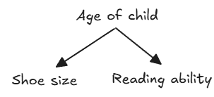
Age of child is a confounder because older children tend to have larger Shoe size and greater Reading ability. You will therefore see a correlation between Shoe size and Reading ability, even though there is no direct causal link between them. If we hold the child’s Age constant, the correlation will disappear.
3. Colliders: A → B ← C, where A and C both independently lead to B.
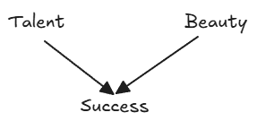
For actors, Talent and Beauty can both contribute to Success, but Talent and Beauty are not causally related to each other. This leads us to see correlations in the sampled population where none exists in the general population. If you find out a successful actor is unattractive, that should increase your belief that they are talented. This negative correlation is also known as collider bias or the “explain-away” effect (or Berkson’s paradox). In other words, Talent and Beauty start out independent, but controlling for Success will create a correlation.
Notice the arrows
An arrow between two variables X and Y implies that there is some probability rule or function that tells us how Y will change if we changed X. The relationships may be deterministic or probabilistic, linear or non-linear, simple or complicated. To derive quantitative answers, you will need to add numbers and functions to your arrows.
Omitted arrows are also important as they assume the causal effect is zero.
We won’t always know the full web of relationships between our variables and we can’t always measure them, either. However, causal diagrams are still useful because they let us postulate certain causal relationships and check that against the data. If the data doesn’t support it, this suggests we need to redraw the diagram. But you cannot draw causal conclusions without first forming some causal hypotheses.
Condition on confounders, NOT mediators or colliders
As noted above, in the fork A ← B → C, there is a confounder (B) that creates a spurious correlation between A and C. Conditioning on B lets you separate out the true effects from the spurious ones.
However, conditioning on B when the variables have a chain or collider relationship would be a big mistake:
- In a chain, B is the mediator between A and C—it is the mechanism by which A causes C. If you condition on B, you will disable the causal mechanism and remove the correlation between A and C.
- In a collider, conditioning on B is also wrong. It will create a correlation between A and C where none existed in the first place.
Example: Wrongly conditioning on the mediator
Say you want to work out whether parenting quality affects a child’s future earnings. Assume you have measurable data on three variables:
- Parenting quality
- Child’s future earnings
- Child’s confidence
You might be tempted to control for the child’s confidence, thinking it could be a confounder.
However, if the mechanism by which good parenting improves children’s earnings is by improving their confidence, controlling for confidence will erase (or at least weaken) the relationship between parenting quality and future earnings. This could lead you to conclude, erroneously, that parenting quality doesn’t affect (or only has a weak effect on) future earnings. But the problem is that you’ve “overcontrolled” and blocked the mechanism by which parenting affects earnings.
Example: Wrongly conditioning on the collider
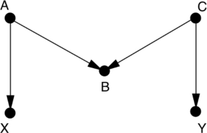
Assume in the above diagram that X is smoking and Y is lung disease.
A is an indication of someone’s attitude towards societal norms.
B is seat-belt usage.
C is an indication of someone’s attitude towards health and safety.
If you want to measure the effect of smoking (X) on lung disease (Y), you don’t need to control for any variables listed above because the back-door path between X and Y is already blocked by a collider at seat-belt usage (B).
In practice, scientists did find a correlation between seat-belt usage and both smoking and lung disease. However, controlling for seat-belt usage would be a mistake and make it a confounder where previously it wasn’t.
Since statisticians have been so confused about what variables to control for, their default practice has been to control for everything they can measure. This has led to a lot of confusion.
Controls give the feeling of specificity, of precision …. But sometimes, you can control for too much. Sometimes you end up controlling for the thing you’re trying to measure.
How to use causal diagrams to reach new conclusions
Pearl goes into a lot of detail on how to use causal diagrams with the “back-door adjustment”, “front-door criterion” and instrumental variables in order to reach some (provisional) causal conclusions. The essence is that you analyse the data by blocking every non-causal “back-door” path between two variables without blocking any causal paths between them. If you do this correctly, you should be able to make some provisional causal conclusions from observational data alone.
The mechanics get quite complicated with many different examples, so you should read the book if you want to learn more. Here, I just give the example of using the front-door criterion to understand the link between smoking and cancer, which Pearl covers in considerable depth.
Example: Front-door criterion applied to smoking
Say you suspect that smoking causes cancer by increasing the tar deposits in smokers’ lungs. You also want to rule out the possibility that smoking gene is a confounder that causes someone to smoke and independently increases their chance of developing lung cancer. You might draw a diagram like this:
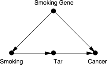
This diagram incorporates two important assumptions:
- The Smoking Gene has no direct effect on the amount of Tar in someone’s lungs (so no arrow from Smoking Gene to Tar)
- Smoking causes Cancer only through increasing Tar (i.e. Tar is a mediator).
If you have an observational study and have data on Smoking, Tar and Cancer for each person, you can use the “front door”—i.e. the direct causal path between Smoking on Cancer—to find out the effect of Smoking on Cancer. You don’t have data on the hypothesised Smoking Gene, so cannot control for it. However, you may still be able to use maths to eliminate the confounder.
The steps involved are:
- First, estimate the average causal effect of Smoking on Tar. You can do this by comparing P(tar | smoking) and P(tar | no smoking).
- Next, estimate the average causal effect of Tar on Cancer, while controlling for Smoking (in order to block the back-door path from Tar to Cancer). This involves using the backdoor adjustment [not explained in summary].
This will tell us the average increase in tar deposits due to smoking (P(tar | do(smoking)) and the average increase in cancer due to tar deposits (P(cancer | do(tar)).
Pearl admits that this diagram is unrealistic, because it’s unlikely that Smoking causes Cancer only through Tar. It may also cause Cancer through chronic inflammation or some other means. But the causal diagrams make the assumptions transparent so they can be better discussed and debated.
Limits of causal models
How accurate is your diagram?
Determining what your causal diagram looks like in the first place can be tricky and requires some level of abduction. The usefulness of a diagram depends on how accurately it matches up with reality.
Everything in the real world has some prior cause. But since causal diagrams are simplified representations of the world, your diagram will always have some “root nodes” to start with. This is fine, so long as the prior causes are adequately summarised by the probability you assign to the root node.
Example: Disease as a root node
If you drew a causal diagram to try and understand the base rate fallacy, you might have a causal link Disease → Test. Since you don’t have arrows going into Disease, Disease will be a root node here.
In reality, there may be many things such as family history that may cause Disease. However, as long as you know that family history will not affect Test, you do not need to represent it as a node on the graph and just incorporate it into your prior probability for disease (i.e. P(Disease)).
You can falsify models but you cannot prove a model is correct
Causal models are more like hypotheses in that they can be falsified. For example, if you postulate a causal relationship A → B → C, but your data does not show that A and C are independent when you hold B constant, then your model is incorrect.
However, a causal model can never be shown to be fully correct. Because we don’t know the entire web of relationships between variables, there may be lurking confounders that we haven’t taken into account.
Still, you can reach use causal models to reach some causal conclusions using observational data. Those conclusions may come with caveats (e.g. “assuming there are no other confounders that we haven’t taken into account”), but they are nevertheless helpful as they quantify how much uncertainty remains and let future researchers know what to focus on.
A new paradigm has evolved according to which it is okay to base your claims on assumptions as long as you make your assumptions transparent so that you and others can judge how plausible they are and how sensitive your claims are to their violation.
Some hypotheses can only be tested with interventions
Drawing your causal hypotheses with a diagram also helps you understand which causal hypotheses can be distinguished by data, and which ones require interventions.
For example, we cannot distinguish the fork A ← B → C from the chain A → B → C using observational data alone, because the two models have the same independence conditions. You can only distinguish these two with an intervention.
Another example might be when we cannot measure the confounder (so cannot apply the back-door criterion), or mediator (so cannot apply the front-door criterion) and or any instrumental variable.
Other Interesting Points
There is a lot that I haven’t covered, and I strongly recommend reading the book in full if you want to understand causality. Some of the parts I’ve omitted include:
- Path diagrams, developed by Sewall Wright to understand how guinea-pigs inherited their coat colours.
- Deeper dive into Bayes’ Rule and Bayesian networks.
- Francis Galton’s quincunx and regression to mediocrity.
- Paradoxes: The Monty Hall problem, Simpson’s Paradox and Berkson’s paradox. Pearl explains how these problems are confusing because we naturally think of causality, rather than probabilities.
- Mediation analysis — using counterfactuals to move from first rung of the Ladder of Causation to the third rung.
- Using causal diagrams to combine results of different studies to reach newer conclusions.
My Review of The Book of Why
The Book of Why is an excellent but incredibly dense read. As someone without a strong background in data science or maths, I found it quite challenging on my first read, especially when reading at night. It got better as I prepared this summary and used AI to help with me understand some of the more puzzling parts. I can definitely see how causal diagrams can be useful in setting out one’s thinking, but I think I’ll need a bit more practice before I have a strong grasp on them.
I don’t think the difficulty I experienced reading this is Pearl or McKenzie’s fault, though. The topics are just inherently complex, and I actually thought they did a great job balancing accessibility and thoroughness. For example, I’d heard Bayes’ Rule explained several times before (e.g. in Algorithms to Live By) and knew how to apply the formula, but the authors’ explanation went deeper than anything I’d read before and I feel like I now have a more solid understanding of it.
I can imagine statisticians bristling when they read this book, as Pearl is quite scathing of their field and many eminent statisticians. Personally, I find Pearl’s arguments on this rather convincing but, to be fair, I’ve only heard his side.
As someone quite worried about Artificial Intelligence, I was reassured when Pearl said he thought they were still on the first rung of the ladder of Causation. Less so when I learned he said in September 2023 that they had moved up to rung “one and three-fourths”. Interestingly, in that same interview Pearl says he thought “ChatGPT actually slowed down our progress toward general AI”, because it uses deep learning instead of causal reasoning. But he thinks that may be a good thing, because of the dangers of general AI.
Maybe it’s a blessing that ChatGPT is so stupid and society is so intoxicated with it. So maybe we are safe from the danger of creating the new species I mentioned [general AI].
Given Pearl’s concerns about general AI, I find it hard to understand why he would choose to work in this field.
Let me know what you think of my summary of The Book of Why in the comments below!
Buy The Book of Why at: Amazon <– This is an affiliate link, which means I may earn a small commission if you make a purchase through it. Thanks for supporting the site! 🙂
If you enjoyed this summary of The Book of Why, you may also like:
6 thoughts on “Book Summary: The Book of Why by Judea Pearl and Dana McKenzie”
I’m still confused on how Pearl defines causality here. If causality isn’t reducible to probabilities, then how can we mathematically express causality? Am I missing something?
The main point is that causality also has a direction, so you need diagrams (or the do-operator) as well to express it mathematically.
Interesting. I like causal diagrams. Kind of odd how simply drawing arrows can give you new insights or at least clarify your thinking, but I think it works.
Yes, it can seem very obvious when you think about it. But also easy to overlook if you’re used to working mostly with numbers and scatter plots.
Regarding Pearl’s comment on:
” “ChatGPT actually slowed down our progress toward general AI”, because it uses deep learning instead of causal reasoning.”
Overall, I think he is overestimating a human’s ability to conduct causal reasoning and underestimating general AI. There are a few layers to this, and to me, we can split this between the unconscious and conscious part of the human brain.
In terms of the unconscious part of the human brain, one of the key functions is to find correlations between different events, just like current deep learning AI approaches. The human brain does a lot of correlation recognition and applies some simple rules and heuristics which gets it pretty far. In this sense, current AI (Chat-GPT, Deepseek and friends) are similar in deductive power to the human brain. And we can see this in how these machines are already at a similar level of intelligence to approximately a graduate student in every field known to man.
However, humans have more than just the unconscious part of the brain. We are conscious beings! Using our logic and frameworks, such as applying the concepts in this “Book of Why”, we are able to attempt to define true causality and figure it out (to an extent).
Extrapolating a bit, my personal thinking is that the unconscious part of the human brain doesn’t do true causal reasoning, as the mathematicians describe it, but through our conscious mind, we can achieve it. Consciousness is one of the least understood areas of the brain currently and nobody really knows what’s going on.
If consciousness (and causal reasoning) is your definition of general AI, then yes, currently approaches are likely far away (and that’s probably good thing!). If your definition of general AI is just if they’re bloody smart and good enough to start replacing a lot of jobs, I think we’re almost there!
Due to the complexity of the topic, I probably need to give this a proper read if I want to provide any commentary on its points.
You raise an interesting distinction between the conscious and unconscious brain. I’ve generally thought of the relevant distinction as being more between inductive vs deductive reasoning, with humans possessing both plus the ability to integrate the two. Unconscious brain relies more on inductive reasoning (correlations plus some simple rules and heuristics, as you say) while the conscious brain uses both deductive and inductive.
My impression is that when Pearl was writing, deep learning approaches were mostly inductive and correlational. But as you point out, current AI like Deepseek seem to employ more deductive reasoning (I’m not sure how they actually work though). So the success of Deepseek would actually seem to support Pearl’s point that there’s only so much computers can learn from pure correlations, and that you need some form of reasoning or deduction to reach general AI. I wonder where he’d put current AI reasoning models on the Ladder of Causation – he might well upgrade them past Rung 1.75.
I agree that how close we are to general AI depends heavily on your definition. Personally, I think a key point is when the same AI can perform lots of different jobs. So if we have 100 different AIs that can replace a human at 100 different jobs, but each AI can only do perform its specific job, I’d still call that narrow AI. Of course, such narrow AI can still be highly disruptive and impactful and we shouldn’t underestimate it. But a single general AI that can do all those 100 jobs is something else altogether — and far scarier for us as a species. I suspect such a general AI would probably have to be skilled at integrating deductive and inductive reasoning, but it might do so in a very different way from how we humans currently do it.